
Project Overview - Sorelle
Sorelle is a modern jewelry brand inspired by sisterhood, connection, and quiet sophistication. Designed for women who embody soft power — graceful, grounded, and effortlessly elegant — the brand redefines what it means to shine. Each piece is crafted to celebrate the women who shape us, blending timeless minimalism with sentimental storytelling.
Package — The Master Muse
Full Brand Strategy
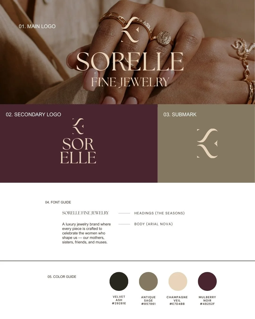
Full Logo Suite
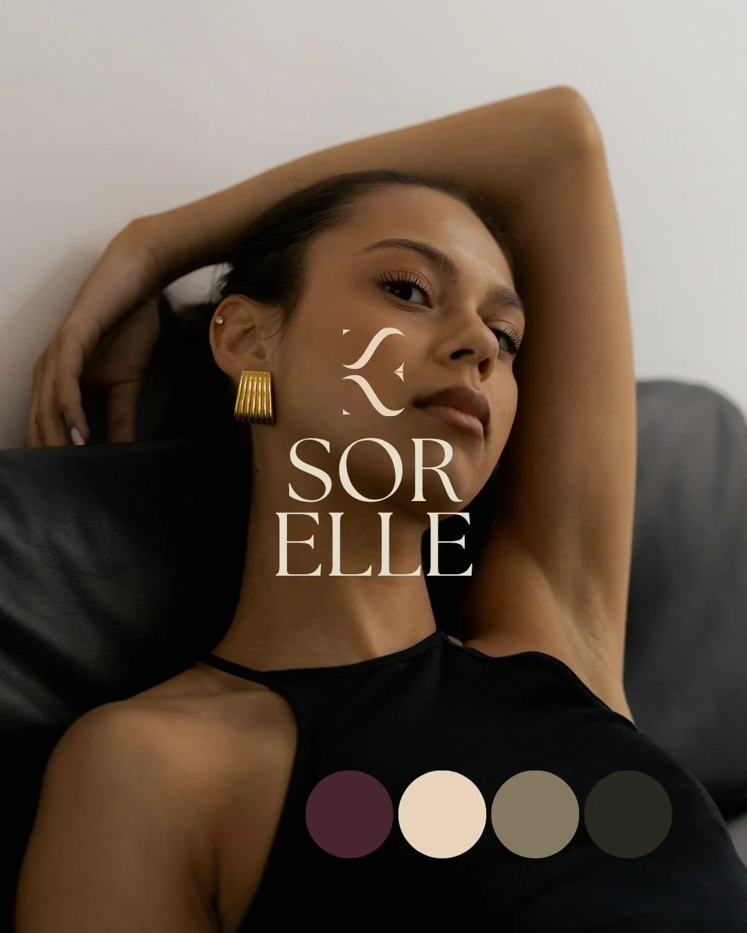
Curated Color Palette
Font System + Usage Guide
Custom Brand Pattern
Social Media Launch Assets
Brand Guidelines PDF
Package Design
Services

The Strategy
The goal for Sorelle was to create a brand that embodies quiet luxury through emotion — merging timeless design with the intimacy of personal connection.
The strategy centered around three pillars:
Sisterhood as Storytelling — positioning jewelry as emotional heirlooms that honor relationships between women.
Soft Sophistication — a minimal aesthetic rooted in warmth, softness, and editorial restraint to stand out from flashy jewelry brands.
Modern Heritage — balancing old-world craftsmanship with contemporary simplicity to create a brand that feels born timeless.
Every visual and word choice was intentional — from the muted color palette to the refined typography system that mirrors fine jewelry design: delicate, structured, and enduring.
Visual Direction
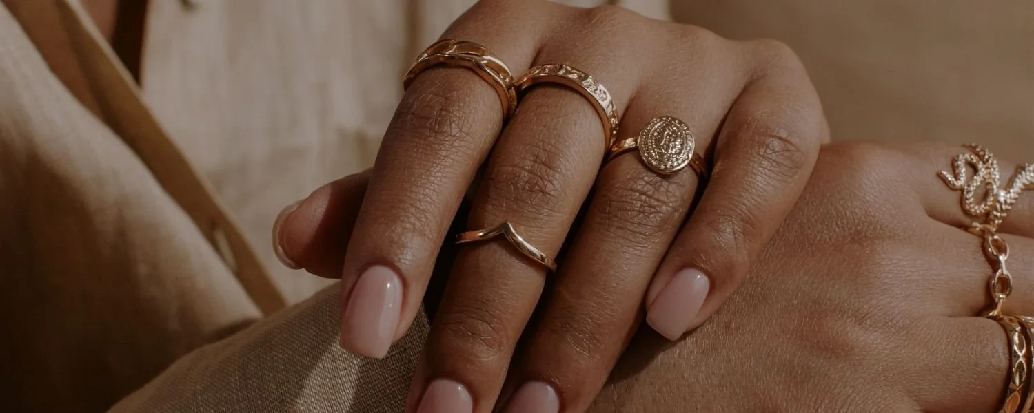
The Sorelle identity is rooted in timeless femininity and understated luxury — drawing inspiration from soft textures, natural light, and heirloom craftsmanship. Every visual detail was designed to reflect the heart of the brand: celebrating the women who shape us.
Color Palette:
Velvet Ash (#29281E) — grounding depth and quiet strength
Antique Sage (#857861) — natural elegance and calm sophistication
Champagne Veil (#E7D4BB) — luminous warmth and refinement
Mulberry Noir (#48252F) — bold femininity and emotional richness
Each tone works together to create a palette that feels both modern and classic — soft enough to evoke grace, but strong enough to convey legacy.
Typography:
The Seasons — an elegant serif chosen for its sculptural beauty and editorial poise
Arial Nova — a clean, modern sans-serif for clarity and balance
Together, they form a brand world that feels tactile, refined, and effortlessly luxurious — a reflection of Sorelle’s mission to honor every woman’s story through timeless design.
The Outcome
Sorelle Fine Jewelry now stands as a brand that fully reflects its purpose: honoring the women who shape us through timeless, intentional design. Every element — from the sculptural serif typography to the Velvet Ash and Mulberry Noir palette — reinforces the feeling of heirloom-level luxury and emotional depth.
The refined identity elevated Sorelle from a jewelry brand to a storytelling experience. Clients now describe Sorelle as meaningful, sophisticated, and deeply personal — a brand that celebrates legacy as beautifully as it celebrates style.
“Mercy & Muse Studio understood exactly what I wanted Sorelle to represent — legacy, femininity, and quiet luxury. The brand they created feels like a love letter to the women who raised us. Every client who discovers Sorelle now feels the emotion behind the pieces before they even try them on. It’s everything I dreamed of and more.”